Air Quality in Southwestern Pennsylvania
A focused look at Carbon Monoxide, Nitrogen Dioxide, and PM₂.₅ on August 2 2025
Narrative
Southwestern Pennsylvania has a distinctive relationship with its air quality. The region’s terrain of steep hills and deep valleys creates beautiful scenery, but also influences how pollutants behave in the atmosphere. These landforms can trap air masses, allowing emissions to accumulate rather than disperse quickly. Combined with heavy interstate traffic, long-established industrial facilities, and sudden weather shifts, this geography contributes to conditions worth monitoring closely.
The information presented here comes from hourly air quality sensor data collected on August 2, 2025. Coverage extends across Allegheny, Washington, Beaver, Westmoreland, and surrounding counties. The monitoring network tracks several pollutants, but three are of primary focus: Carbon Monoxide (CO), Nitrogen Dioxide (NO₂), and fine particulate matter (PM₂.₅). Carbon Monoxide largely originates from vehicle exhaust and fuel combustion in industrial processes. Nitrogen Dioxide is a byproduct of burning fossil fuels, most often elevated along busy roads and near certain industrial sites. PM₂.₅ refers to microscopic particles that can travel deep into the lungs and remain there, sometimes for extended periods. These particles may be locally generated by activities like traffic or regionally transported, for example from wildfires hundreds of miles away.
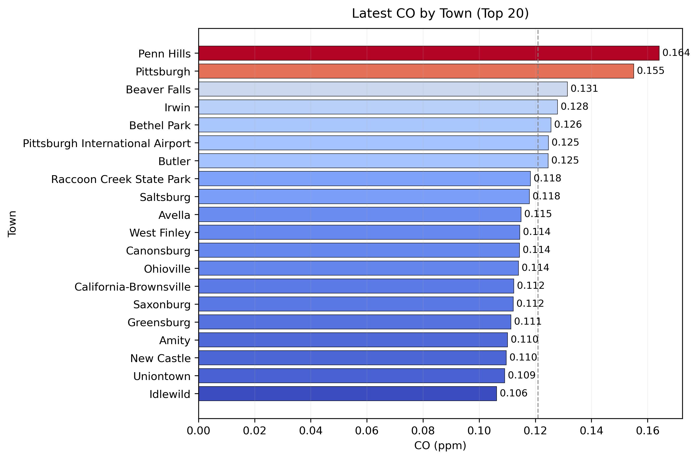
For this analysis, the emphasis is on Carbon Monoxide. The dataset contains readings from dozens of sensors, each reporting values hourly. To provide a clear, up-to-the-minute view, only the most recent reading from each location was used. This approach offers a snapshot of current conditions rather than an average over time. The accompanying visuals tell complementary parts of the story: the first is a CO hotspot map that makes it easy to see where concentrations are higher; the second is a scatterplot comparing CO and PM₂.₅ values while using bubble size to indicate NO₂ levels; the third is a ranked bar chart listing towns in order of their latest CO measurement.
The three graphics show that urban corridors, such as the Pittsburgh metro area, generally record higher CO and PM₂.₅. This aligns with the presence of more vehicles, denser development, and more combustion sources. Elevated or less densely populated areas often show lower readings but can still experience temporary increases due to weather, industrial activity, or traffic surges. Correlations among CO, PM₂.₅, and NO₂ are imperfect. High CO often coincides with high PM₂.₅, but not universally. NO₂ spikes can appear in unexpected locations when compared solely to the other two pollutants.
The figures were created in Python using pandas, GeoPandas, and Matplotlib, processing the hourly sensor dataset for multiple counties. For the hotspot map, points were slightly shifted for clarity and privacy. The scatterplot visualizes relationships between pollutants, while the bar chart organizes towns from highest to lowest CO reading. Color scales emphasize differences, making trends and outliers more visible. Notably, the maximum CO value in this snapshot is well below levels regarded as hazardous for short-term exposure.
Although this represents a single day, the same process can be applied over longer periods to track seasonal changes. This type of geographically detailed and time-sensitive monitoring provides a richer understanding than averages alone. This helps to identify persistent concerns, spikes, and the reasons behind them.
Figure 1: CO Hotspots
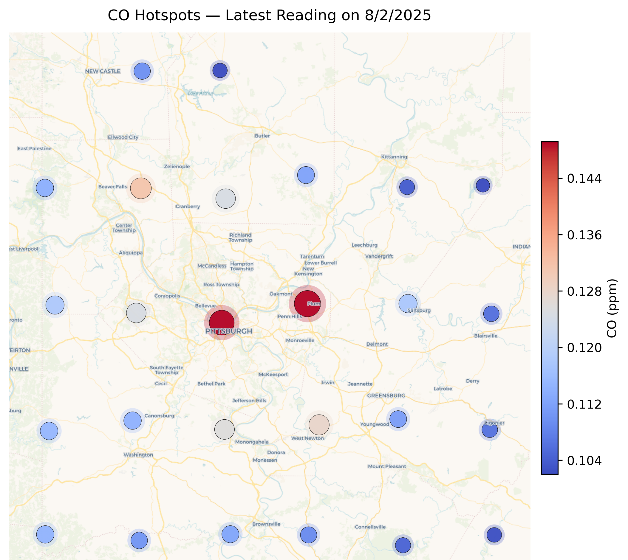
Figure 2: CO vs PM₂.₅ with NO₂ Bubble Size
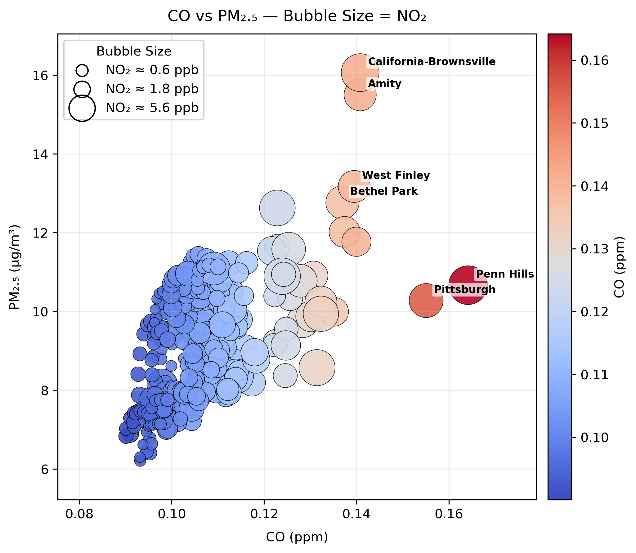
Figure 3: Latest CO by Town
Main Takeaway
Even in one day you can see big differences in air quality across Southwestern Pennsylvania. Urban areas trend higher, while rural spots are usually lower. Local spikes still matter, and they can happen anywhere. Tracking them over time is the only way to really understand what’s going on and figure out what’s causing them. One snapshot is useful, but the real story comes from seeing how these numbers change day after day and how CO, PM₂.₅, and NO₂ rise and fall together or sometimes move in completely different ways.